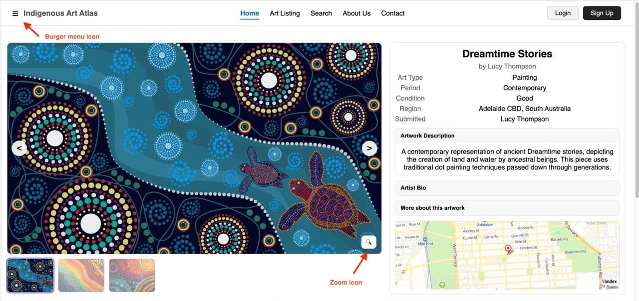
For a semester-long university project, my team and I designed and built a platform for cataloguing Indigenous Australian art, the Indigenous Art Atlas. It moved through four stages, research and wireframing, a front-end prototype, a full-stack build, and a round of usability testing, so it grew from paper sketches into something real users actually tried.
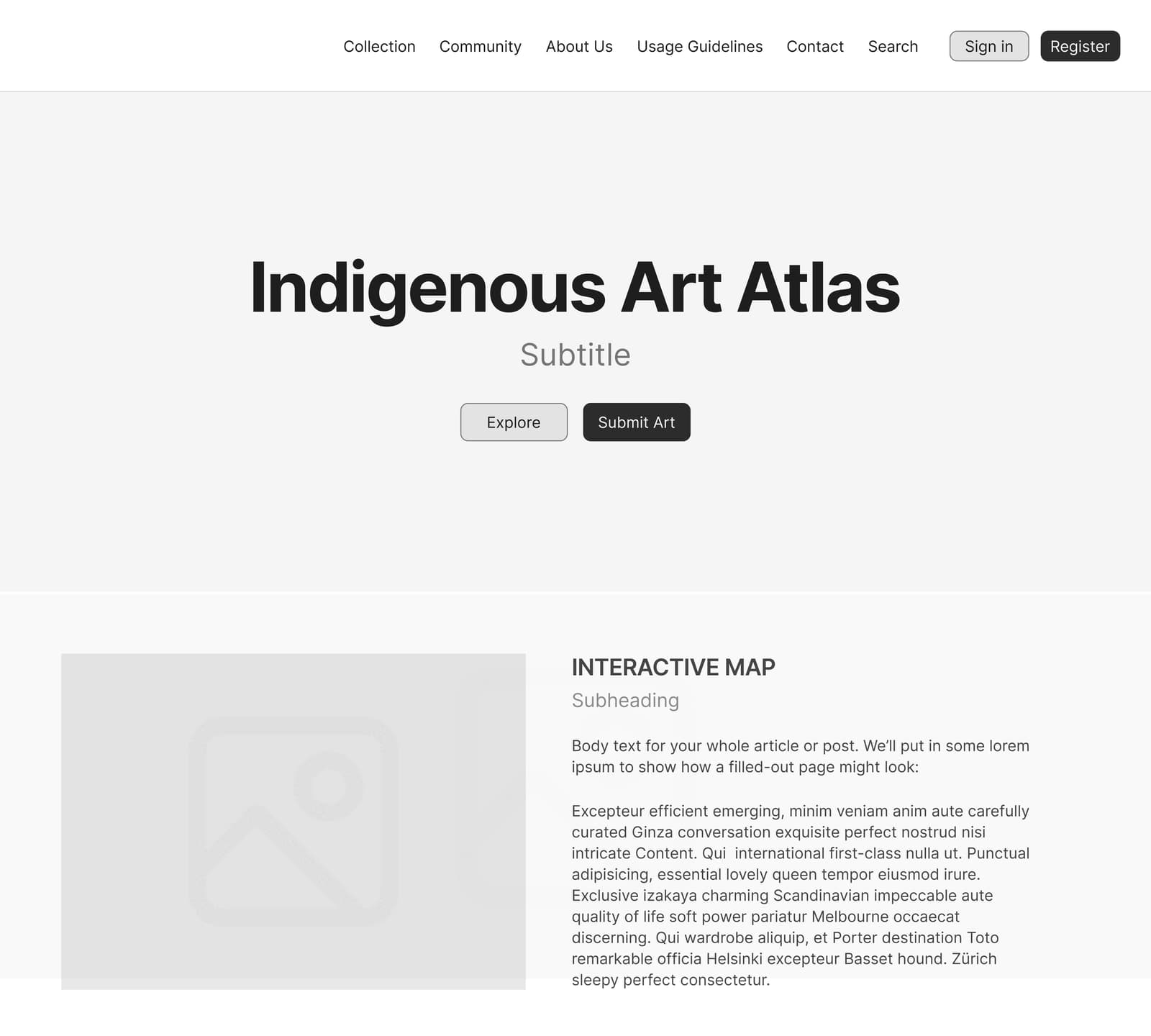
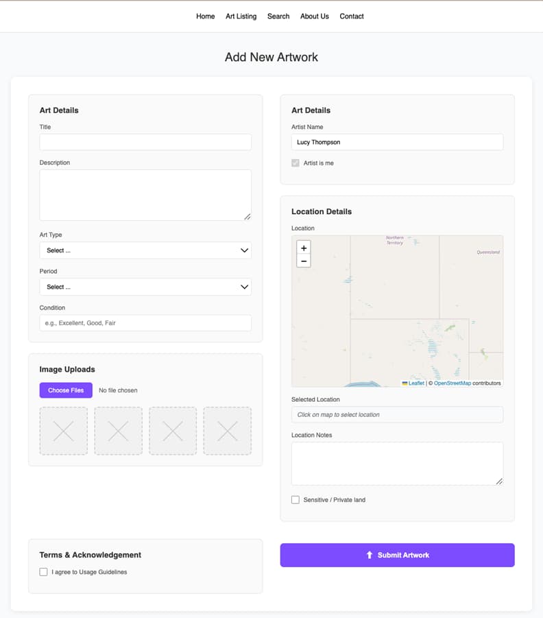
The idea was a public site where anyone could browse Indigenous art by location on an interactive map, or by type, period, and region, while contributors, whether an artist or someone submitting on their behalf, could add new pieces through a moderated form. Cultural sensitivity shaped some of the real design decisions: contributors can mark a work's location as sensitive or on private land so significant sites aren't pinpointed publicly by default, and every submission goes through an admin approval queue before it appears on the site.
We built the backend in PHP and MySQL, with proper CRUD for artwork records, categorisation by type and period, and separate accounts for contributors and administrators. The artwork shown throughout the prototype, including the pieces pictured here, is AI-generated placeholder imagery the team used for testing, not real Indigenous artworks submitted by an artist.
Once the site actually worked, we ran a real usability study rather than assuming it was fine: five participants, a System Usability Scale questionnaire, and a per-task ease rating. The average SUS score came out to 84.5, well above the usual benchmark for good usability. The hardest task, unsurprisingly, was submitting new artwork, since it has the most steps of anything on the site.
The score mattered less than what came out of watching people actually use it. That surfaced specific, fixable problems: the burger-menu icon was too small for people to notice, the zoom button on artwork images had the same issue, and the search page only showed two results by default, which made it look emptier than it was. Those turned into concrete recommendations rather than vague notes: bigger, more visible icons, five results by default instead of two, and guided tips for first-time visitors.